A menu used to be a pretty permanent thing; once a menu had been finalised, you’d be stuck with the same design for months or even years until you could afford to print a new set of menus. Even adding new things to the menu was a chore and this is why the “specials board” was originally conceived.
But this is the 21st century and in the 21st century, the special’s board is no longer necessary. Indeed, with a digital menu board, every board is a specials board.
That doesn’t mean, however, that consistency in your design isn’t important. It’s just that a digital menu allows you the room to flex your creative muscles a little more openly and change it to suit the needs and tastes of your customers whenever you desire. With that in mind, here are a few tips to consider when designing your first digital menu.
Utilise takeovers
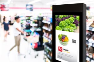
The great thing about digital menu boards is that they are not just boards – they’re full-blown LCD displays. Many restaurants might choose to launch limited time offers and promote these offers by making them (quite literally) take over the entire menu for 5-10 seconds. These digital menu takeovers should be designed to be intrusive without being annoying and hold enough information to make their message clear in just a few short seconds. The menu itself should also be designed to accommodate them.
Keep it clean
There should be some strategy in the placement of every part of your digital menu and flexibility that allows you to add or remove things without causing too much chaos. This means keeping the menu generally clean and basic, with no clutter. Animation is great, of course (more on that later) but too much of it can also make it hard for customers to understand what’s going on and where their attention is meant to be directed. This also means using menus that scroll through different screens if your restaurant offers too many items to fit on one page.
Put the good stuff where it’ll be seen
Studies have shown that most customers read digital screens from the right to the left rather than like a traditional book. They typically start at the top-right of the menu and then scan down to the bottom-left. This means you should always put the high-margin items on the top-right of the screen.
Make it move
We’re not saying you have to create a Disney style show for your menu but a little bit of movement here and there certainly won’t go amiss, particularly if you’re trying to court a younger audience. Rich media captures 10 times as much attention as static images so take advantage of that extra eye time and create subtle but effective animations that draw in the right eyes at the right time.
Personalise the experience
Perhaps the most exciting thing about digital menu boards is how you can use them to tailor each customer experience. Analytics can be used to tell which items a certain customer might be more inclined to buy and menus can be altered on the fly to promote these items to that customer. That truly is the world we’re living in today and things are only going to get better.
Image: 010110010101101 / Shutterstock.com

About author